Automative Monthly Facebook Report
In order to measure the effectiveness of my social media campaigns, I decided to create an automative report within RStudio that prints and saves a pdf statistical report measuring monthly growth in factors such as impressions, post reach, likes, and comments. This allowed me to quickly assess my social media strategies.
NOTE: The slideshow below consists of jpeg versions of the pdf report.
NOTE: The slideshow below consists of jpeg versions of the pdf report.
About the Report: Because Facebook is the primary social media platform used by the Better Business Bureau, I decided to focus solely on this medium of communication within the report and did not include Instagram and Twitter statistics. I focused on both page and post statistics in my analysis of social media performance. Within the page statistics, I looked at the number of follows, likes, impressions, reach, and engaged users. I used this information to create bar graphs comparing the monthly growth within these categories. For the post statistics I focused on reach, impressions, the top posts of the month by type, demographics, and post reach over time to paint a specific picture of what posts do well and when. For both page and post statistics, I broke down certain criteria by paid versus organic reach to clarify which patterns of growth were through organic interaction versus those from boosted (paid) campaigns. I made sure to include captions so that people unfamiliar with Facebook terminology would be able to follow along. I also made sure to calculate the net change within these variables and programmed the color of the text to appear red if negative and green if positive. This report has three potential formats through which it could be printed. These formats are variable on the size of certain graphs within the report. I chose to consistently utilize one color scheme in this process for an aesthetic report, that is both engaging and informative.
I have only posted the reports for May 2018 versus June 2018 , and June 2018 versus July 2018, because I only wished to disclose information that I had a direct impact upon. While I did schedule all the posts up until early October, I would no longer have access to those analytics to run the report after they would be posted, as I would be returning back to the University of California-Berkeley. The Better Business Bureau serving North Central Texas can now print this report at the conclusion of every month and test,create, and improve strategies by measuring the effectiveness of their chosen campaigns.
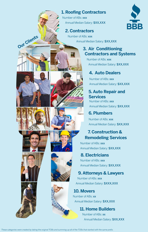
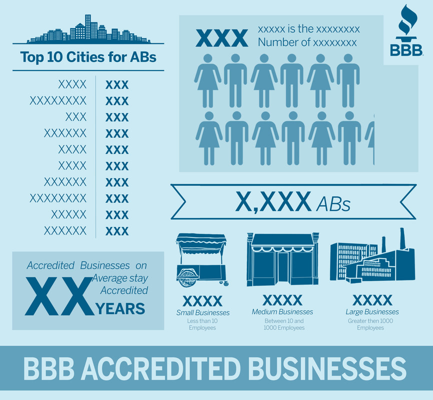
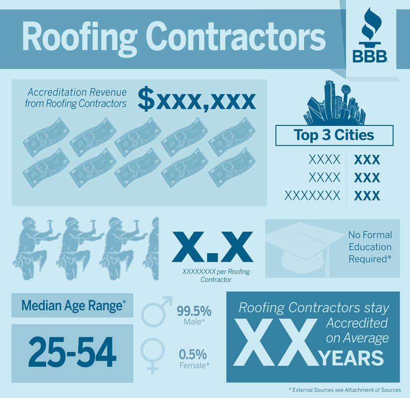
Accredited Businesses Customer Profiling
For the next project I selected and analyzed the accredited businesses within the eBindr Hurdman database. I created three categories of infographics for this project:
- A general infographic analyzing all of the BBB Accredited Businesses
- An infographic identifying the Top 10 types of businesses housed within Better Business Bureau Serving North Texas's profiles
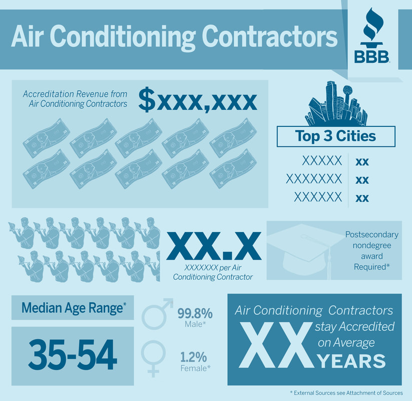
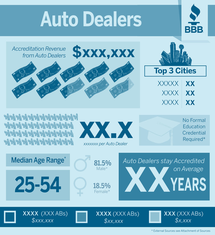
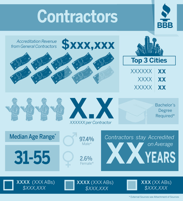
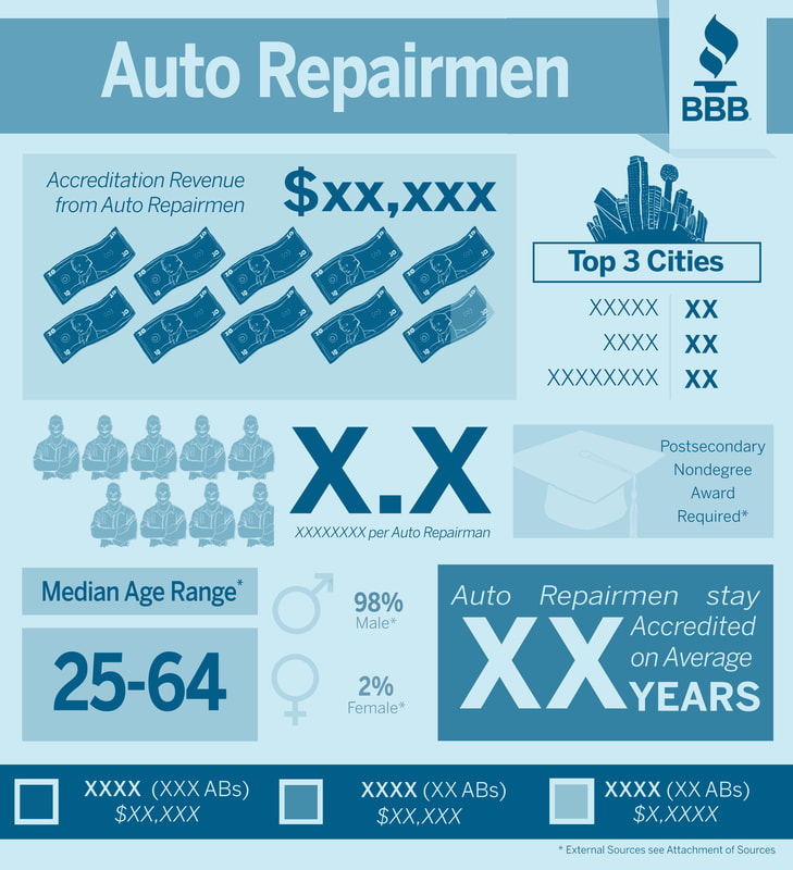
- 5 customer profiles focusing on client characteristics of the top 5 types of accredited businesses.
|
|
|
|
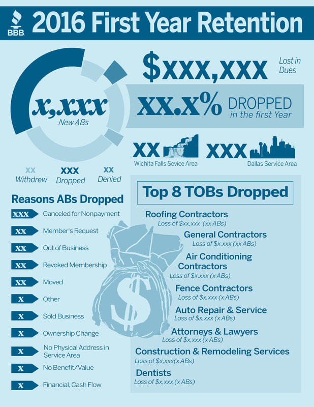
First Year Retention Analysis
Using a combination of RStudio and Microsoft Excel I analyzed the accredited businesses that dropped after their first year of accreditation during the year of 2016. I combined several .csv files within the eBindr database to gather more information about these businesses, and used this comprehensive file to find commonalities amongst them. I then used Photoshop to create an infographic that simplifies my findings.